The Matplotlib Foundation · 20 min
The Figure and Axes Model
Why the mental model matters
DS101 got you making charts. This course gets you making charts you control. The difference is understanding how matplotlib is actually structured — because every confusing error message, every layout that doesn't quite fit, and every default you can't override makes immediate sense once you know the model.
There are two ways to use matplotlib. Most tutorials show you plt.hist(...), plt.title(...), plt.show() — the pyplot interface. It looks like the MATLAB API it was modelled on, and it works fine for quick exploration. The problem is it hides the objects doing the work. When you want to put two charts side by side, customise tick positions, or build anything beyond a single figure, you hit invisible walls.
This lesson introduces the object-oriented (OO) API — the layer pyplot wraps — and explains when to use each.
The four-layer hierarchy
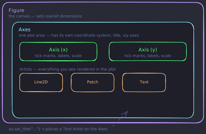
Every matplotlib output is built from a hierarchy of objects:
Figure — the outermost container. Think of it as the canvas. It sets the overall dimensions and holds one or more Axes.
Axes — a single plot area with its own coordinate system, x-axis, y-axis, title, and data. A Figure can contain many Axes. Note: this is not the same as an axis (a single number line). The naming is a common source of confusion.
Axis — the individual x or y number line. Each Axes contains two Axis objects (or three for 3D plots). You'll interact with these when customising tick marks and labels.
Artist — everything you see in a plot is an Artist: lines, rectangles, text, tick marks, spines. Figure, Axes, and Axis are themselves Artists. When you call ax.set_title("..."), you're setting a Text artist on the Axes.
Figure
  └── Axes (can have many)
        ├── Axis (x)
        │     └── Tick Artists
        ├── Axis (y)
        │     └── Tick Artists
        └── Data Artists (lines, patches, collections…)
The dataset you'll use throughout this course
All lessons use a synthetic retail sales dataset. Create it once and reuse it. You won't need to understand the random-data generation logic — just run this once per notebook and reuse the df variable across all lesson examples.
import pandas as pd
import numpy as np

np.random.seed(42)
n = 500

df = pd.DataFrame({
    "date": pd.date_range("2023-01-01", periods=n, freq="D"),
    "category": np.random.choice(["Electronics", "Clothing", "Books", "Home"], n),
    "region": np.random.choice(["North", "South", "East", "West"], n),
    "sales": np.random.lognormal(mean=6.5, sigma=0.8, size=n).round(2),
    "units": np.random.randint(1, 20, n),
    "customer_age": np.random.normal(38, 10, n).clip(18, 70).astype(int),
    "profit_margin": np.random.beta(3, 7, n).round(3),
})
It has numeric columns, categorical columns, and a date column — enough to demonstrate every chart type in this course.
The pyplot interface
You won't write this pattern from scratch every time — but you need to recognise the pyplot structure so you can tell when AI-generated code mixes interfaces incorrectly.
import matplotlib.pyplot as plt

plt.figure(figsize=(8, 4))
plt.hist(df["sales"], bins=40)
plt.title("Sales distribution")
plt.xlabel("Sales ($)")
plt.ylabel("Count")
plt.tight_layout()
plt.show()
pyplot manages a global "current figure" and "current axes" behind the scenes. Each plt.xxx() call modifies whatever is currently active. This works fine here, but if you create a second figure before calling plt.show(), plt.title(...) applies to whichever figure is "current" — which may not be the one you expect.
The object-oriented interface
Again, you'll generate this pattern from AI, but recognise the OO API structure with explicit fig and ax objects so you can verify the code is using consistent interfaces throughout.
import matplotlib.pyplot as plt

fig, ax = plt.subplots(figsize=(8, 4))
ax.hist(df["sales"], bins=40)
ax.set_title("Sales distribution")
ax.set_xlabel("Sales ($)")
ax.set_ylabel("Count")
fig.tight_layout()
plt.show()
The difference: plt.subplots() returns explicit fig and ax objects. You call methods on ax directly. There's no global state, no ambiguity — ax is the exact Axes you're modifying. This is the pattern you should default to for everything beyond a one-off exploratory plot.
Notice the naming asymmetry: plt.title() becomes ax.set_title(). Most plt.xxx() functions have an ax.set_xxx() counterpart.
When to use which
| Situation | Interface |
|---|---|
| Quick exploration in a notebook | pyplot (plt.hist(...)) |
| Any multi-panel layout | OO API |
| Reusable chart functions | OO API — pass ax as a parameter |
| Saving to file programmatically | OO API — call fig.savefig(...) |
In practice: start with fig, ax = plt.subplots(...) by default. You'll never regret having explicit handles.
Inspecting the objects
You can inspect any matplotlib object's attributes and methods to understand its structure. This is useful when you get an error or need to understand what's available on an object.
fig, ax = plt.subplots()

print(type(fig))   # <class 'matplotlib.figure.Figure'>
print(type(ax))    # <class 'matplotlib.axes._axes.Axes'>

# A Figure holds its Axes in a list
print(fig.axes)    # [<Axes: >]

# An Axes holds its two Axis objects
print(ax.xaxis)    # <matplotlib.axis.XAxis object at 0x...>
print(ax.yaxis)    # <matplotlib.axis.YAxis object at 0x...>
You won't often need to dig this deep, but knowing these attributes exist means you can always inspect your way to a solution when the API docs are unclear.
Summary: Every matplotlib output is a Figure containing one or more Axes, each of which contains Axis objects and Artist objects for data. The OO API (fig, ax = plt.subplots()) gives you explicit handles and is the right default for anything beyond quick exploration. The pyplot interface (plt.hist(...)) is a thin wrapper that manages state globally — convenient but opaque.
Next lesson: With the object model in hand, you'll learn how to customise every visual element of a plot — titles, labels, ticks, spines, and themes.
Knowledge check
4 questions · pass with 70% or better